
 |  |  |  |  |  |
| UNDERWATER |
Hello and welcome to the sixth and last part of our environment lighting tutorial series! In the preceeding parts we discovered the world of natural environmental lighting, artificial kind of lighting, and the mixtures between them. In our last feature we will be discussing a rather special case: the case of an underwater environment situation. This implies some more or less 'unusual' prerequisite. More precisely, we will be in need of a truely visible 'medium', let's call it volume or ether. Most often people tend to fake such volume by simply using so called 'volume shadows' on their 3d lights, i.e. lights casting a visible 'light ray' into an apparent (though not existant) volume. This is not the real deal, however it is a favored method of both professionals (because it renders fast, which is essential specially for animations) and beginners (because its rather easy to set up and.. well I dont know. But its like the No.1 thing people wish to do when getting their hands on a 3d program). Anyhow, we will be going the way of the cowboy, or cowgal, and do it the tough style. Since this is all about rendering stills, we can afford to have this extra nuance of 'bought' prettiness. Well. So we're back aboard.. though this might be a rather inappropriate description - we are sunk! The ship's body is below the waterline and filled with seawater. To believably illustrate this situation shall be the challenge of our tutorial. We will also be creating an eerie, or unfamiliar, uncommon lighting to support the feeling of being in a different world. Before we start to do anything we need to have a few thoughts on this different world, because this time we actually have a whole different (or lets say: a more exaggerated) situation than usual. Mainly there are two things we need to consider: First WHAT makes underwater look underwater, and second HOW can we achieve/simulate it. These might sound trivial, and in fact the circumstances are so trivial indeed, that most people seem to forget about them. Lets begin by comparing our usual situation (land / more or less dry air) with our new situation (under the sea). In our habitual environment, like our office, the living room, or wherever inside a building, we usually do not have much of a visible 'volume' - except if we romp around and raise some dust. When this dust gets into the air, it naturally, like any matter, reflects light. Thus it gets 'visible'. The more dust we raise into the air, the 'thicker' the apparent volume gets, and the light rays seem to become actually visible - although all we see is the dust reflecting them. There is a nice (albeit philosophical) quote of Andre Gilde that aptly says: "Without the dust, in which it flashes up, the sunray would not be visible". Now there is more 'things' than plain dust in the air we breath, in fact there is tons of gases and particles, which all make up what is commonly called the 'aerosol'. This rather invisible mixture of microscopic solid particles and liquid droplets have the same reflecing, or essentially scattering impact on incident light as the regular (substantially larger) airborne dust. This has an interesting effect: when light gets scattered (i.e. forced to diffusely deviate it's naturally straight trajectory) by a surface much smaller than the wavelength of it (like the aerosol ingredients), the so called 'Rayleigh scattering' occurs. Named after the physicist Lord Rayleigh, this general approximation rule says that the scattering 'probability' of a light ray is dependant on its wavelength - whereas the smaller wavelengths (blueish, ultra violet domain) have a higher chance of getting scattered than the larger wavelenghts (reddish, infrared domain) (Fig. 1). Have you ever asked yourself why the sky is blue? THIS is the answer. The rather neutral, virgin and 'white' sunlight enters the earth's atmosphere, and the distinct portions of it get scattered by the aerosol - since the blue part of the light has a largely higher probability to get scattered, we seem to be surrounded by a diffuse blue environment. As opposed to a sunset or dawn, where mostly unscattered light from the direction of the sun reaches the observer - and appears red, due to the lower wavelength. Fair enough. Much pondering about the air, but what about our concrete underwater situation? Well, its basically the same story! The ocean IS blue. Not only because it reflects the sky, but also because of the Rayleigh rules explained above. This scattering rules basically apply to anything at anytime. In cgi we only neglect it, or often we fake it based on observational facts. And after all, computing true wavelength based Rayleigh scattering is a seriously complex task, and its questionable if the effort can be justified, since it's mostly rather marginal effect would 'steal' the rendering time we could spend on other things that make our image pretty. Have you ever asked yourself, why e.g. Maxwell Render outdoor images look faint, whilst the indoors look pimp? Because they neglect this light scattering (at least to this point in time)! The scattering effect is not as eminent in the indoor/interior renderings, but has a large impact on the 'naturalness' of outdoor, larger scale situations. The Rayleigh rule is omnipresent, unless you're in complete vacuum. And it is even more evident in 'thicker' mediums, or volumes, like the ocean water, which is full of more or less tiny particles. The only difference here is that the light gets scattered and absorbed earlier, which is often referred to as a higher 'extinction'. A light ray entering such volume has a certain probability to either get scattered forwards (along it's original trajectory), backwards (the direction it came from), something inbetween, or to get completely absorbed by some particle. Every volume has it's own characteristics at how much of each of the former criteria is being applied, not to forget that the wavelength of the light ray looms largely over this... This behavior can be modelled, or simulated by a so called ray marching shader. We are not going to obey the wavelength dependant rules strictly (it'll be more of a guesstimation), but lets finally get our hands on our actual scenery. As a reference I like to use http://www.underwatersculpture.com by Jason Taylor, which has various and no less beautiful photographs on the day-to-day-things-underwater subject. |
|


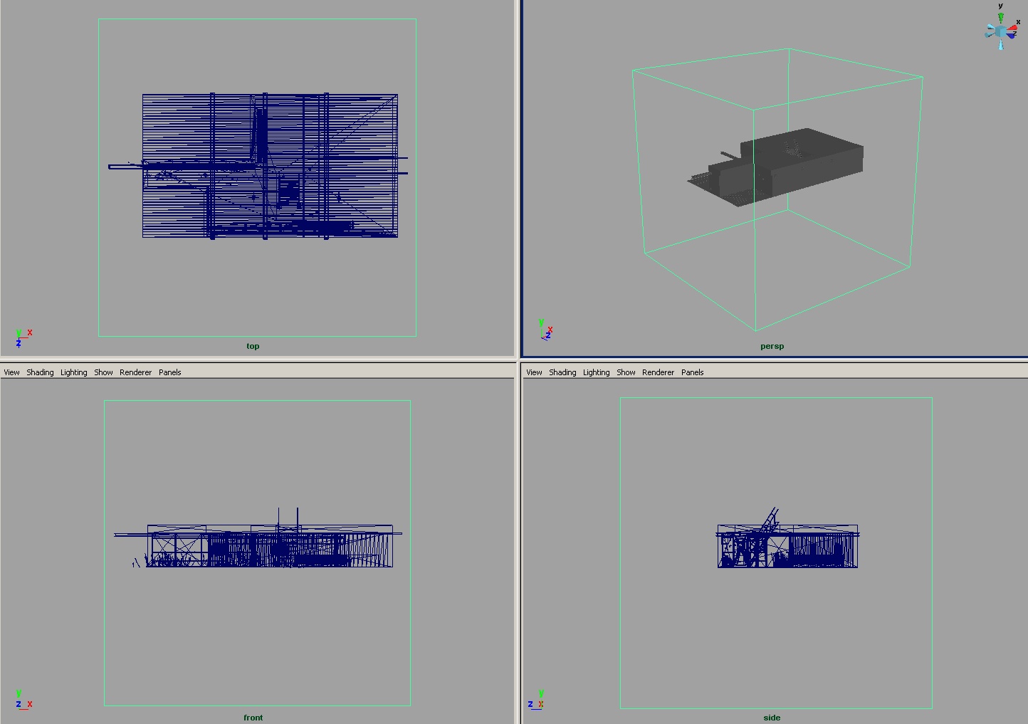
To build up our medium, I decided to simply create a large surrounding cube (Fig. 2) as a 'container' of our volume. This is the simplest and mostly fail-safe way to set up this kind of stuff. We could alternatively build our volume through our camera's volume shader slot, which would basically have the same effect unless a ray would hit 'nothing', where this second way would simply return the un-approximated environment color. And besides this alternative way could take longer to render, because the ray marcher could possibly take some more and unncessary steps further into the depth (not in our case however). The ray marching utility we will be using is the rather ancient though still nicely working mental ray 'parti_volume' shader, which can be found under the 'mental ray Volumetric Materials' tab in the hypershade. This is not to be confused with the parti_volume_photon, which is used for volume photon tracing, but we wont use photons to obtain indirect illumination in our tutorial anyway. Our method will be a bit less accurate but still nice and fast enough to create our desired look and feel. |
|
Lets have a look at the volume shader. Foremost, we assign a new 'black' surface shader to our cube container, and connect the parti_volume to its shading group's 'Volume Shader' slot (Fig. 3). Thats pretty much it for the set-up part, and we can have a closer look at the parti_volume's diverse attributes. |
|

Most important for our needs right now is the scattering part (Scatter, Extinction), the so called scatter lobes (R, G1, G2, more on this later), and the ray marching quality settings (Min_-, Max_step_len). The other attributes, which we will neglect however, are for filling the volume only partially (Mode - 1 means 'do it' - and Height), to add a noise, or rather density variation (Nonuniform, 0.0 means 'no noise') and stuff we really dont need (Light_dist, Min_level, No_globil_where_direct). As you can see, there's lots of techy stuff, but we'll concentrate on the essential things of it (Fig. 4). First the scattering factors, Scatter and Extinction. Scatter basically controls the color of the medium and is closely related to the Extinction, which controls the density of the medium. Both go hand in hand, and the hassle about this is that to work with half-way rational values we need to have a quite dark Scatter color and a quite low Extinction factor - if any of the two goes into higher extremes we'll typically end up with undesired results. So I decided for a value of RGB 0.035, 0.082, 0.133 for the Scatter color, which is a natural blueish tint. Since we dont do wavelength dependant calculations I decided for this predominant color that mimics and supports the Rayleigh rules explained above. For the Extinction I used a low appearing value of 0.004, but keep in mind that this is all correlative with the Scatter color, and very sensitive. So this value will give us an extinction that swallows almost all of the light in the rear corners, and that's way enough. Now about the scattering lobe. That's a bit more difficult at first glance. Basically, a negative value for G (either G1 or G2) means a backscattering lobe (back into the direction the light ray came from) and a positive value means a forward scattering lobe (forward along the original trajectory of the light ray) - and R simply means the mixture between G1 and G2. So you typically chose one backward scattering lobe (i.e. a negative value for G1) and one forward scattering lobe (i.e. a positive value for G2), and weighten both with the R attribute. Whereas 1.0 for R means 'use only G1' and 0.0 means 'use only G2' and 0.5 would weighten both equally... I know - there must have been some really funny guy at mental images who wrote this shader, and I'm pretty sure he's still laughing up his sleeve. Anyhow. I chose a rather foward scattering volume, but I encourage you to experiment with the values. The forwardish scattering creates these nice glow-like appearing light sources when the light points towards the camera (its vice versa if the light is e.g. behind the camera of course). So I used R 0.1, G1 -0.65, G2 0.95 for my final image. Last but not least I trimmed the Min_- and Max_step_len to 50.0 each. This attribute decides at which distances (step lengths) to stop for looking up a volume sample - hence the rays 'march' through the medium, and the lower the step lengths the more samples will be taken, the better (less noisier) the image quality gets and the longer it'll take to render. If you think it takes too long to render, boost this value up. On the other hand, if you think you get too much noise and artifacts in your image, reduce it. Generally however the manual proposes to use a value of about 10 percent of the Max_step_len for the Min_step_len, so you might want to try this as well (5.0min/50.0max). It is worth mentioning that the step length values are in actual scene units, so in our case it looks up a volume sample each 50 centimeters. |
|

Ok, we have our medium set up and running (almost), now lets create some lights to make it shine. Since our volume shader relies more on direct rather than indirect light we cannot rely much on the later final gathering for the 'diffuse' incoming illumination. That's why I created two area lights for this job, one above the hatch, and one right behind the rear windows. For the main light source however I used two spot lights shining in from outside (Fig. 5). |
|

For this main lights I used a mib_blackbody helper utility at 2200 Kelvin to obtain a rather warm and diver-flash-light-like color (Fig. 6) (the method of using a blackbody temperature as color source has been explained more extensively in the two preceeding tutorials!). Though one could also imagine that its the sun shining in from windows, you decide it, and feel free to play around with it (to put it with Bob Ross: there's no failures, only happy accidents!). |
|

The two area lights need a mixture of natural blue (due to Lord Rayleigh's stuff) and green (due to many small greenish micro organisms floating in the sea, like plankton or algae). This mixture is commonly referred to as cyan, turquoise, mint or cobalt, depending on which color is weighted, or most felicitous: aquamarine (Fig. 7). |
|

So far so good? Uhm.. there's one last very important thing we need to consider. Remember the funny shader programmer? He decided to omit every light that is NOT on his list. That's strange attitude, but not stranger than the other stuff in the parti_volume, no? So we need to link every light on it's the light list (Fig. 8). You can either put in the (case sensitive!) name of the light, or mmb drag and drop the light transform from the outliner onto a spare field (you need to re-select the parti_volume each time you connect one light, so the mechanism can add another open slot). |
|

Now that we have this part running, lets think about adding a few details that would add more to the underwater impression. In Maya we fortunately have the Paint Effects system, which is easy to use and even has some built-in 'underwater' brushes (Fig. 9). I used some sea urchins here and there, a hint of shells, and a few starfishes all around. Also I added a little of the seaweed to some corners. |
|

To be able to render the Paint Effects with mental ray we need to convert them to regular polygons (Fig10). I also converted their Maya shaders to mental ray mia_materials, which is always a good idea to obtain a consistent shading behavior across the scene, since in our case everything else is built with them as well. This needs to be done manually however. |
|

That's it we're finally ready to render. I used a fixed sample rate of 2/2 this time (Fig11). This is quite a brute-force way, and you might consider using an adaptive sampling of 0/2, but be advised to tune up the sampling of the area lights along with it, since they are all left at 1/1 right now. Also you should consider lowering the parti_volume step lengths if you encounter artifacts with the adaptive sampling. It is also worth mentioning that to actually 'cast' a shadow into the volume, we need to have a shadow (and general max-) ray trace depth of at least 4. |
|

For the indirect illumination I chose a rather low-quality appearing final gathering with diffuse bounces (Fig12). This time, due to the volume stuff, the final gathering will not add all too much to the image, but it still has a nice contribution to the general look of our piece. |

Before we push the render button we need to chant the gamma mantra though, as always. Since we want our image to look nice, natural and appealing, instead of dark, smudgy and cg-ish, we need to pull it from it's default color space, i.e. mathematically linear, into the one we are used to see, i.e. gamma corrected sRGB. There's a deeper explanation on this matter in the very first of the tutorials, the one about sunny afternoon. To recall the essential basics however, lets repeat why we need to care about the gamma issue BEFORE we render out our image. As mentioned, the (any) renderer does it's internal calculations in mathematically linear manner, which foremostly is a good thing. We could pick this truely linear result and take it into our post application and gamma correct it there (because gamma correction / putting things into the sRGB color space is desirable in almost any case - probably almost everything you see, i.e. photographs, pictures are in this sense already gamma corrected, without your knowledge, they usually ARE per se). IF and as you can see that's a big IF, we wouldnt use image textures, which are ALREADY gamma corrected from the outset. When using regular image files, which usually have the sRGB/gamma correction 'baked' into them a priori, we need to remove this gamma correction, before we RE-apply it on the whole image. Makes sense, no? I know its confusing, but unless you dont want to have double-gamma-washed-out-looking textures we need to obey this little rule. Applying the right gamma on the whole image afterwards isnt enough, if we want the textures to look as they should (i.e. as we are used to see them, in their sRGB color space). Now, many people dont care about this whole issue and thus render in the plain mathematically linear space. And wonder why their images look strange and unnatural, and have this strangely dark and smudgy look and blown out highlights and overbright areas all over. Specially realtime 3d has yet to 'learn' that mathematically linear rendering is not what the eye is used to see in nature (the human brain reaches a 'gamma corrected', or rather logarithmically corrected image too, if you will! Although human perception is far more complex of course). So we want to have it gamma corrected/sRGB. Our renderer mental ray has a built-in function to automatically 'remove' the gamma from the textures before rendering, and apply the inverse of this gamma on the rendered pixel/image. To do so, we go to the Primary Framebuffer tab in the render globals and put the appropriate gamma value, which is 1/2.2 or 0.455, into the Gamma field (Fig13). |
|

As a last enhancement lets turn on the 'detail ambient occlusion' mode of our mia_materials. It should all be set up already by default, we simply need to switch it on by selecting the mia_materials and raising the Ao_on value from 0 (off) to 1 (on). We can do this easily for all selected shaders at once by using the attribute spread sheet (Fig14), from the Window> General Editors> Attribute Spread Sheet menu. |
|

We should come up with a render similar to what I got (Fig15). I rendered to a regular 16bit image format, and took it into photoshop for some contrast and color adjustments. That's the most fun part of it. |
|

After playing around with the white balance, crushing the blacks, enhancing certain color elements (i.e. the blues and aquamarines), and after having fun with the 'liquify' function in Photoshop I came up with my final interpretation (Fig16). I also put a 'dust/grime' image on top of the image, to support the feeling of a thick medium. I hope you like it. And I hope you enjoyed following our environment lighting tutorial series, as it is time to say good bye for the time being. I have had a great time sorting out my guesses on all the subject matters, and most defintely learned a lot along the way, as you hopefully might have as well. If you have any question, critic, comment, addition or whatever input on the tutorials or me, dont hesitate to contact me in one of the variously available ways. |
|
Credits: Original concept and geometry - Richard Tilbury Original idea - Tom Greenway Editor - Chris Perrins Tutorial - floze |

| | | | | |
What a spectacular effort, deepest gratitude for sharing your knowledge !
ReplyDeleteFirst, let me start off by saying that this is one of the most detailed, well worded tutorials I've read about lighting.
ReplyDeleteNow, I understand this was made with Maya 8.5. For those who are using Maya 2008 (64 bit in my case), you might experience a crash when you setup your volume shader. To fix it, you must plug in "transmat" in your surfaceShader's "Surface material" slot (found in the shading engine node)
Hope this helps!
Thanks for the great tutorial about "parti_volume" shader! It is a best and deepest explanation of that mysterious shader I've ever seen! ^_^
ReplyDeleteThanks man, it's great tutorial, with excellent theory introduction. You did amazing job. (Alex Manita)
ReplyDeleteWhat a spectacular effort, this is one of the most detailed, well worded tutorials I've read about lighting. As I am a student of the Animation i really wan this kind of lighting tutorials, this is the we can say its interor lighting how about extiror lighting? and sir please can u mail this mesh to my mail ID is nilscres@gmail.com
ReplyDeleteThanking You for sharing the grate work with us.
where do we get the scene? I'm interested in sharing this with my Maya class
ReplyDeleteTotally stunning results - just brilliant! Thanks alot for sharing that with us!
ReplyDeleteIt's really really pleasing to see people like you sharing their knowledge.. unfortunately I couldn't get it to work.. Are there any special steps to be done in Maya 2009, or am I just not paying enough attention... And please can you send the base scene to contact@ntashev.com
ReplyDeleteHello Mr. Wild:
ReplyDeleteThank you very much for this wonderful and clear set of tutorials on Maya-MR.
Can you please send to me the scene file in order to obtain the same results?
Very thanks in advance,
Sincerely,
Fabiola Merchand.
fabiola_merchand@hotmail.com
I'm a great fan of this series. Thank you for this. But I also cannot get this method of the parti_volume shader to work in 2009. Only with photons active does it work. Has anyone been able to get this tutorial to work with maya 2009?
ReplyDeletehey this is really great can you please send me scene file my mail id is dangersunin@rediffmail.com
ReplyDeleteGreat!!! Awesome tuts!!
ReplyDeletecan u share the maya file so that I can try that
I will be veryvery thanks full~
mail be gktmddyd@gmail.com
Thanks!!!!!
These tutorials are very handy and good stuff!, let me start with that. I have one question though. What kind of cube did you use as a container? And did you apply the surface shader with the volume as a material. I used a poly cube and everything got black. I am using maya 2011.
ReplyDeleteThanks very much!!!
Hi! it looks great but I work with 3d max & need the tutorials for max.
ReplyDeletecan put the max version for this great tutorial? plzzzzzzz
Hello! I love this, but would like to have a copy of the scene files for all the tutorials. I have both a copy of Maya 8.5 and 2011.
ReplyDeleteMy Email is kim5888@sbcglobal.net
Thank you!
Kim Smith
Thanks a lot for this tut, you have no idea how hard i had to look to get a tut in such great detail, love itsul
ReplyDeleteHello... This is a great tutorial! Thank you! It is really excellent! Does anybody have the scene or object file for this or can I download it from somewhere? If you do, could you please send it to: ian@hititstudios.com
ReplyDeleteOh I forget to tell you that I am using Maya. Thanks again. Very much appreciated!
ReplyDeleterespected sir
ReplyDeletecan you please send me this model at pawan.baweja@gmail.com
Floze,
ReplyDeleteThis series of tutorials have helped me understand a ton about rendering since I first saw them (a couple of years ago), so I really wanted to thank you!
I'm not sure if you're still following the comments here, but I'm now trying to get further into it, and I'd really appreciate if you could share the scene file. I can be reached at ph.scatena@gmail.com
Thanks!