|  |  |  |  |  |
| SUNNY AFTERNOON |
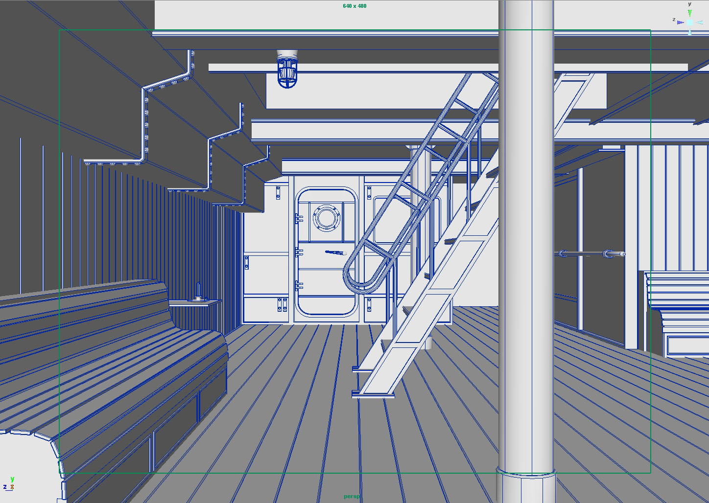
This tutorial series is intended to be used with mental ray for Autodesk Maya 8.5. “Happiness is like the sun: There must be a little shade if man is to be comfortable.” - Let's start our exercise with this little quote by Otto Ludwig. Welcome to the first of the six-part tutorial series, discussing possibly the most challenging kind of 3D environment: interiors. mental ray (for Maya) users typically get cold feet and sweating fingers when it comes to this “closed combat”; the royal league of environment lighting. It’s for no reason though, as all you need for the battle is a simple field manual (this tutorial), and just a little bit of patience... So what is it all about? Let’s have a look at our object for this demonstration (Fig. 1) ... As you can see, we have a closed room; you can tell by the porthole and the characteristic door that it is a room inside a ship. Let’s imagine that it’s a tween deck of the ferry “MS No-Frills”, used as a lounge, and the staircase leads to its upper deck. From a lighter’s point of view, we can estimate by this analysis that there is light coming in from a) the opening in the ceiling where the staircase leads outside, and b) from the porthole and the window beside it. That’s not much, and if you ever took a photograph under such conditions you will know that, even with nice equipment, you would have a hard time catching the right moment (the “magic hour”) to illustrate the beauty of this particular atmosphere. (Atmosphere is also defined, besides by the lighting condition itself, by things like a point in time, the architecture, the weather, and occasionally also the vegetation.) So, for our first tutorial part, we will choose the following scenario: our ship, the MS No-Frills, is anchored somewhere along the shore of Tunisia (North Africa) in the Mediterranean Sea; it’s summer, the time is around early afternoon, and the weather is nice and clear. That’s all we need to know at this stage to get us started... |
|

If you open up the scene, you will see that there’s no proper point of view defined yet. Feel free to either choose your own perspective or use one of the bookmarks I have set in the default perspective camera (Fig. 2). By clicking on one of the bookmarks, all relevant camera attributes (position, orientation, focal length, etc.) are changed to the condition stored in the bookmark. This greatly helps when trying out different views without committing oneself, and without creating an unnecessary mess of different cameras. |
|

Before we start lighting and rendering the scene, we should have a little introduction to the actual shading of the scene and about a few of the technical aspects of things such as color spaces. If you find this too boring then you might want to skip the next two paragraphs as this is not essential, but is nonetheless an explanation regarding how to achieve to the result at the end of this tutorial. |
|
A Note on Shading. All the shaders you see are built on the new mia_material that ships with Maya 8.5. This shader was intended as a monolithic (from the Greek words “mono”, meaning single, and “lithos”, meaning stone) approach for architectural purposes, and it can be practically used to simulate the majority of the common materials that we see every day. Unlike the regular Maya shaders, and most of the custom mental ray shaders, it implements physical accuracy, greatly optimized glossy reflections, transparency and translucency, built-in ambient occlusion for detail enhancement of final gather solutions, automatic shadow and photon shading, many optimizations and performance enhancers, and the most important thing is that it’s really easy to use. And it’s all in one - thus “monolithic”. I therefore decided to use it in our tutorial... |
|
A Note on Color Space. As you may already know, usually all of the photographs and pictures that you look at on your computer are in the sRGB color space. This is because, for example, a color value of RGB 200, 200, 200 is not twice as bright as a color with RGB 100, 100, 100, as you would expect. It is of course mathematically twice the value, but perceptually it is not. As opposed to plain mathematics (like 2 x 100 = 200), our eyes do not work in such a linear way. And here’s where the sRGB comes in... This color space ‘maps’ the values so that they appear linearly. This is why most of the photographs are visually pleasing and look natural, which is not in a true mathematically linear color space. However, almost every renderer spits out these old and truly linear images (because this simply is how computers work - mathematically linear), unless we tell the renderer to do otherwise. Most people are not aware of this, and instead of rendering in the right color space they unnecessarily add lights and ambient components to unwittingly compensate for this error. In Fig. 3 and Fig. 4, you can see two photographic examples illustrating the difference between a true linear (left) and an sRGB color space (right). In Fig. 5, you can see the same from a CG rendering; you’ll notice that the true linear one looks a lot more “CGish” and unnatural. Even if you brightened it up and added/reduced the contrast, you still couldn’t compensate for the fact that it’s in the wrong color space, specially if you carelessly used textures from an sRGB reference (i.e. from almost any digital picture you can find), which adds up even more to the whole mess. This is an essential issue in order to create visually pleasing and naturally looking computer graphics. If you have followed me up to here, and you think you understand the need for a correct color space, then go take a break and get yourself some coffee or delicious green tea and enjoy life for a while - you've earned it! This is all tricky yet fundamental knowledge. How this theory is practically applied in mental ray will be shown later on... |
|


So, let’s get started with lighting the scene... Maya 8.5 introduces, along with the mia package, a handy physical sun and sky system. This makes it easy to set up a natural looking environment and we can then focus more on the aesthetic part of the lighting process, instead of tweaking odd-looking colors. The sky system is created from the render global’s environment tab (Fig. 6). |
|

By clicking on the button, you practically create: a) a directional light which acts as the sun’s direction; b) the corresponding light shader mia_physicalsun; c) the mia_physicalsky, an environment shader that connects to the renderable camera’s mental ray environment (Fig. 7); d) a tone mapping lens shader called mia_exposure_simple, which also connects to the camera’s mental ray lens slot. It’s also worth mentioning here that this button also turns Final Gathering ON. |
|

Now that we have a default sun and sky system set up, we are almost ready to render. Before we do the first test render, let’s make sure we are in the right color space, as mentioned. By default, we are rendering in true linear space (for an explanation please refer to the previous notes on color space), which is - for our needs right now - not correct. The lens shader we created however brings us into a color space which closely approximates sRGB by applying a 2.2 gamma curve (see the Gamma attribute) globally to the whole rendered image, as we calculate it. Generally, this is a good thing and is desirable. But if we apply a gamma correction in this way, then we would have to “un-gamma” every single texture file in our scene. This is due to the fact that the textures already have the “right” gamma (this is usually true for any 8bit or 16bit image file), and adding a gamma correction on top of that would double the gamma and could potentially wash out the textures’ colors. What a bummer! So, we either have to “un-gamma” every texture file (boring and tedious), or instead of the lens shader’s gamma correction, we can use mental ray’s internal gamma correction (still boring, but less tedious). As you can see from Fig. 8, we set the Gamma value in the Render Globals’ primary framebuffer menu to the desired value, which is - simply because mental ray works this way - 1 divided by the value (2.2 for approximating sRGB in our case), which equals 0.455. At the same time, we also need to remove the gamma correction of our lens shader, so we must set its Gamma attribute to 1.0 (linear equals no correction; you can select these shaders from the hypershade’s Utilities tab). Thus we completely hand over the gamma correction to mental ray’s internal mechanism, which automatically applies the right “un-gamma” value to every of our textures. There are no more worries for our color textures now. If we use “value” textures however (like for bump maps, displacement maps, or anywhere where a texture rather feeds a value than an actual color), we'd have to disable this mechanism for the particular “value” texture by switching a gammaCorrect node in front of it, with the desired gamma compensation (2.2 in our case) filled into the gammaCorrect's Gamma attribute (note: this attribute does not mean the value for the actual color^gamma function, it rather indicates the desired compensation situation, i.e. the “inverse”, or reciproke of the gamma function - no one ever would tell you about that, but now you know better). This is a long-winded theory, but now we’re ready to go! |
|

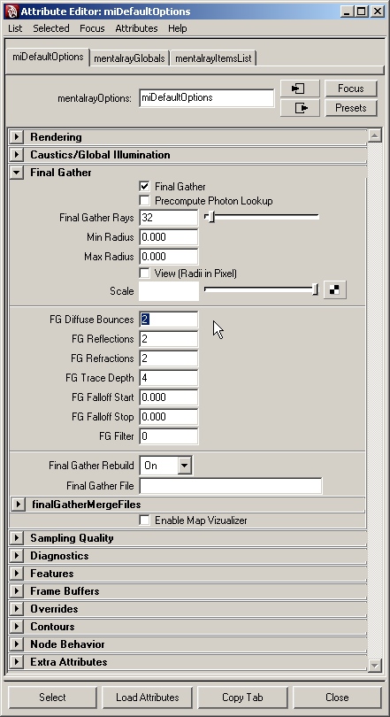
I tweaked the Final Gathering settings (Fig. 9) so that we will get a relatively fast converging, yet meaningful, result. I also turned down the mia_physicalsun’s Samples to 2. |
|

It’s kind of dark and has a few errors (Fig. 10), mainly because of insufficient ray tracing settings. |
|

Let’s now increase the general ray depths (Fig. 11) and the Final Gathering ray depths (Fig. 12). We’re also turning the Secondary Diffuse Bounces on. However, the Secondary Bounces button in the Render Globals only sets their Bounce Depth to 1; we want it to bounce twice so we’re selecting the actual node where all the mental ray settings are stored, which is called “miDefaultOptions”. |
|


You can do this by typing in “miDef*” in the input line with LMB Select by name on (the asterisk is a wildcard for lazy people like me, see Fig. 13). |
|
Once we select the miDefaultOptions, all more or less hidden mental ray settings are exposed to the attribute editor. There’s also some stuff in the mentalrayGlobals node, but we’re focusing on the Final Gather tab in the miDefaultOptions right now. Let’s set the FG Diffuse Bounces attribute to 2 (Fig. 14). These ray depth settings should suffice to get the result at the end of this tutorial. |
|

Let’s re-render (Fig. 15). It is still pretty dark, but you can tell that the indirect light contribution is sufficient (don’t worry about detailed shadowing, we’ll get to that later on), so we need to actually raise the exposure level of our piece, somehow. |
|

Remember, we’re all still on the very basic default settings for everything. One setting used to tweak the exposure is the Gain attribute in the mia_exposure_simple, which is connected as a lens shader to our camera. Let’s increase the Gain value to 0.5 (Fig. 16). |
|

That’s much better, and gives a more natural feeling (Fig. 17). |
|

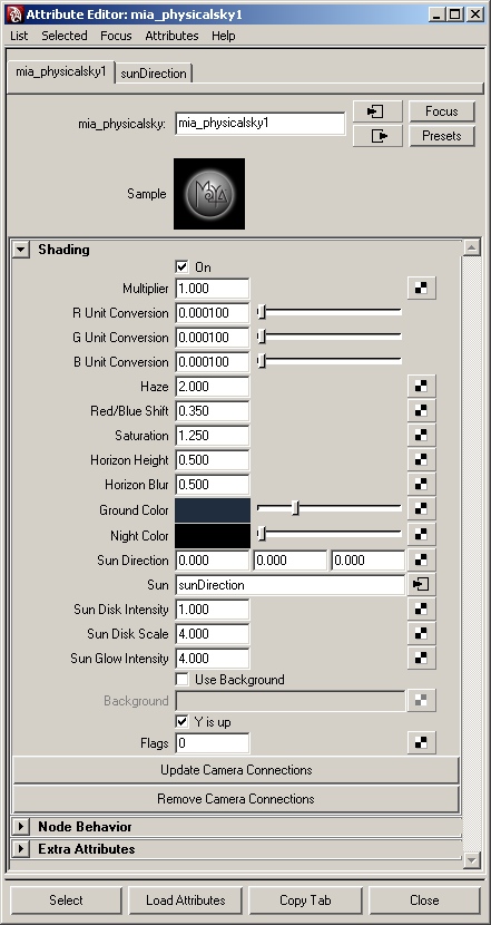
Now we can start to actually make decisions on the lighting and aesthetic accentuations. For this part, please don’t feel constrained to the settings and colors that I choose - feel free to follow your own ideas! I’m rotating the sunDirection to X -70, Y 175, Z 0 to accentuate certain elements by direct sunlight, and I’m setting the attributes of the mia_physicalsky to the values you can see in Fig. 18. I increased the Haze value to 0.5 (note that this attribute takes values up to 15, so 0.5 is rather low). Then I set the Red/Blue Shift to 0.1, which basically means a white-balance correction towards reddish (towards blue-ish would be a negative value, like -0.1). I also raised the Saturation attribute to 2.0, which is it’s maximum value. I then made slight adjustments to the horizon, which does not have much effect on the global look but I experimented with what we could see through the porthole and the window. |
|

The last thing I changed was the Ground color. I gave it a greenish tint because I thought this gave it a more lagoon-like feeling, and I think it gives the whole piece a more interesting touch (Fig. 19). From my own point of view, this is a good base for what we intended to accomplish with the early afternoon in the Mediterranean Sea scenario. |
|

If we’re satisfied with the general look, we can then go about setting up the scene for a final render. Firstly, let’s increase the Final Gathering quality, because we can reuse the Final Gathering solution later on. As you can see from Fig. 20, I raised the Accuracy to 64, but more importantly, and especially for the shadow details, the Point Density is now at 2.0. With a denser Final Gathering solution we can also raise the Point Interpolation without losing too much shadowing contrast. I also set the Rebuild setting to Off, because the lighting condition is not changing from now on and we can therefore re-use existing Final Gather points. |
|

Let’s have a look (Fig. 21). As you can see, there is still a lack of detail in the shadowed areas, especially in the door region. We can easily get around this with the new mia_materials which implement a special Ambient Occlusion mode. You only need to check on for Ambient Occlusion in the shaders, as everything else is already set up fairly well by default (all I did was set the Distance to a reasonable value and darkened the Dark color a little). |
|

The main trick is the Details button in the mia_material (leaving the Ambient at full black). By turning on the Details mode, the Ambient Occlusion only darkens the indirect illumination in problem-areas, avoiding the traditional global and unpleasant Ambient Occlusion look. See Fig. 22 with the enhanced details. |
|

Note: to adjust the shaders all at once, select all mia_materials from the hypershade, and set the Ao_on attribute in the attribute spread sheet to 1 (Fig. 23) (the attribute spread sheet can be found under Window > General Editors > Attribute Spread Sheet). Also note that switching on the Ambient Occlusion in the shader scraps the Final Gathering solution; it will be recalculated from scratch. If you find the Final Gathering taking too long, turn the Point Density down to 1.0 or 0.5, as this still gives you nice results but the lighting details will suffer. |
|

Now let’s increase the general sampling quality (Fig. 24). The sample level is now at Min 0 and Max 2, with contrast at 0.05 and the Filter set to Mitchell for a sharp image. Last but not least, if you are having problems with artifacts caused by the glossy reflections, raise the mia_material’s Reflection Gloss Samples (Refl_gloss_samples) up to 8 for superior quality. You can do this with the attribute spread sheet, as well. |
|

For the final render, I chose to render to a 32bit floating point framebuffer, with a square 1024px resolution. This can be set in the Render Globals (Fig. 25). |
|

If I want to have the 32bit framebuffer right out of the GUI (without batch rendering), I need to turn the Preview Convert Tiles option On and turn the Preview Tonemap Tiles option Off, in the Preview tab of the Render Globals (Fig. 26). |
|

Important: I also need to choose an appropriate image format. OpenEXR is capable of floating point formats and it’s widely used nowadays, so let’s go for that (Fig. 27). |
|

When rendering to the 32bit image, you will get some funky colors in your render view, but the resulting image will be alright - don’t worry. After rendering, you can find it in your projects images\tmp folder. Fig. 28 shows my final result: a pretty good base for the post production work. |
|

Since we rendered to a true 32bit image, we have great freedom for possibilities. See Fig. 29 for my final interpretation where there is no additional painting, only color enhancement. Try it for yourself! I hope you have enjoyed following this tutorial as much as I enjoyed writing it! |
|
Credits: Original concept and geometry - Richard Tilbury Original idea - Tom Greenway Editor - Chris Perrins Tutorial - floze |

| | | | | |